Pages

Thursday, September 30, 2010

Fleeting

I'm so excited about some recent scrappy news that I can't really share with you yet.
All I can say is that I was asked to contribute a layout to something that's happening in an upcoming issue of one of our Australian scrapbooking magazines. This was an honour I was only too happy to accept!

But with the "pressure" of creating something I knew was going straight to print, I must admit I had a practice run first :-)


So this was the first layout I created. I'm not going to give anything away by telling you any of the specific criteria or rules, but I'll just let you enjoy the layout as it is!


And although this layout would have done the job, I just felt like I needed a second option so I could choose my favourite. And I felt like I wanted to do something that was a little bit more "me."


I couldn't help playing with some of my new goodies - so while all the papers and the red alphas are from old Sassafras collections, the green alphas are new Sassafras, and the chipboard pieces are from the new Cosmo Cricket Togetherness range that I picked up from Handmade by Suzanne.


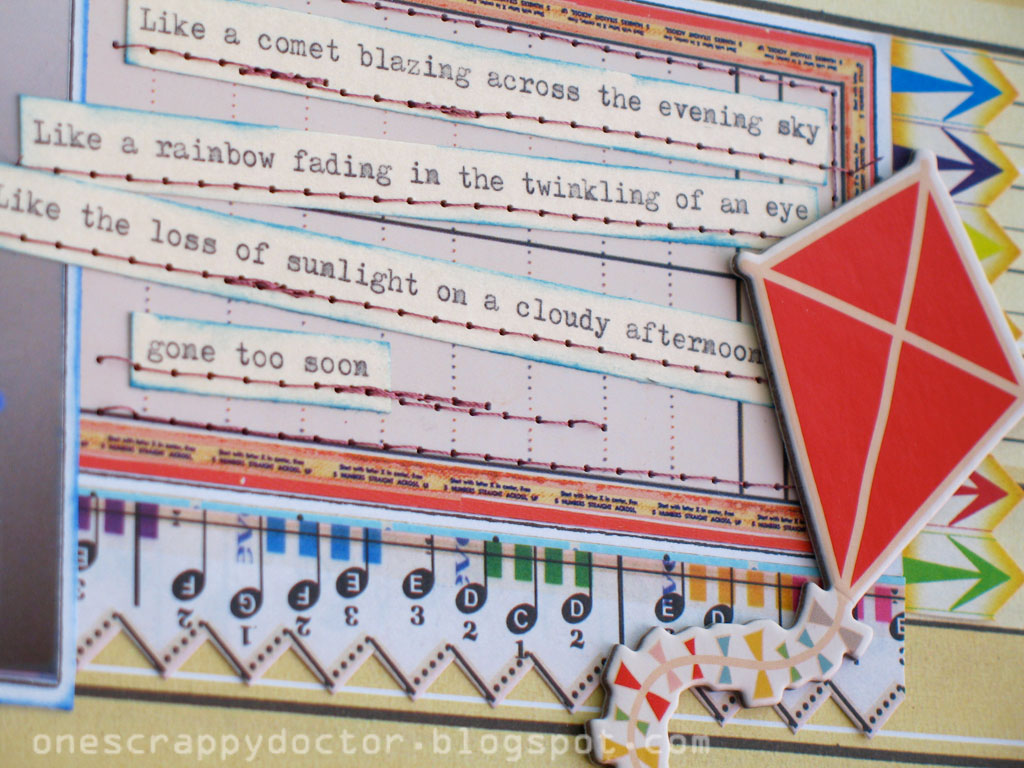
The quote on the journaling is from a Michael Jackson song.... hopefully it doesn't come across as too sad, and more as just wistfully thinking about how quickly time flies.

Anyway, I'll let you know more about the real project in a couple of month's time!

Saturday, September 25, 2010

Honey Roasted

I created this layout a few months ago for the sketch challenge at Handmade by Suzanne, but just realised I had never posted it here.


It was back when I was obsessed with the new October Afternoon collections; 'Thrift Shop' and 'Fly a Kite' so I've used them both here.


A handmade flower, very similar to the one I did a tutorial on over here. Topped off with a paper brad I made using my I-Top.


The story on this one is about the day I turned on the oven to pre-heat it and soon after began to smell a very lovely melting honey fragrance. I didn't immediately click to what was happening until I began to smell a not-so-lovely burning plastic smell, closely followed by plumes of black smoke pouring from our oven.

It seems my imaginative young daughter had (once again) been playing hide-and-seek with the pantry items, and had decided the oven was a perfect hiding place for the honey. Not sure what all that was about, but she sure learned not to do it again :-)

Tuesday, September 21, 2010

Curious?

Are you curious to know what happened to the XOXO Challenge blog that I was/am on the current DT for?
Well...... so am I!

After a month of silence in August from our blog's founder and leader we heard that she had her husband return home unexpectedly early from serving overseas and she needed to spend some quality time with him. Very understandable, I've got no problems with that. I figured everything was just going to be delayed by a month. And it worked well for me because I actually had my original August layout picked up for publication, so it allowed me some extra time to make a new one :-)


So you might be able to guess that since I'm showing you this layout without any further prompting to take part in any current challenges it must appear that the XOXO blog is extinct. Well, I cannot be sure since we are still only getting silence from the leadership. But presumably after this long I can only imagine it's not going ahead.


Anyway, on the positive side of things, I'm really happy with how this layout turned out which is why I couldn't wait any longer to share it with you! I made bunches of folded flowers out of a mix and match bundle of old stash (mainly Basic Grey) and that always makes me happy.


I couldn't get those letters to stick very well (cheap $2 shop deal!) so I had to either glue them on, or sew them on and you know I cannot let a layout go by without some messy stitches so the choice was easy :-)


The journallng is about that stage that Moodles went through where she's discovering her hands and is totally facinated by them. She looks at them and turns them around, and picks things up and is learning to clap them and wave them. Isn't it a wonderful time?!

This layout was inspired by a blog post by Evie S where she showed us some baby-shower decorations, which included these kinds of handmade flowers and pinwheels which she used as wall decorations. I didn't realise it as the time but hers were on a massive scale - she later went on to show us how she made them. It's all very interesting, I recommend you go and check out her beautiful blog.

Saturday, September 18, 2010

My Prayer

One year ago I barely knew what CHA stood for, let alone what it means in this crafty industry I find myself totally addicted to. Now I find myself quickly turning into such a product snob. If it wasn't released in the last 6 months then I'm not very interested.

How bad is that?
I don't like it and I'm desperate to change.

So I was really glad when I received my DT kit from Handmade by Suzanne this month to see it was filled with one of the glorious "older" lines. (And honestly, when I say 'old' I mean it was released earlier this year!!) These rich and luxurious and totally gorgeous My Mind's Eye So Sophie papers have definitely made me see the error of my ways :-) 


And I did get this wonderful Paper Inklings 12x12" doily which made the perfect background for my layout. I attached it to some vanilla American Crafts cardstock for a textured dreamy look. I kept my other papers more muted by swiping them all with white ink to soften the vibrant colours.


I did splash around a little bit of colour to jazz it up a little, but I'm glad the focus is still mainly on those paper stars I folded. The stickers all came from the So Sophie collection too, and if that bird looks awfully familiar to you it's because this is actually just the negative outline left from when I used the actual sticker on this layout here.

The turquoise glitter alphas are new, and available in the shop. And the other pale green ones are from Pink Paislee.


I just adore this photo of my two girls snuggling (even if it was when they're sitting in front of the TV!!) and so wanted to journal more about my feelings rather than any particular event, so I've written down a few of my prayers for them.

And it's not quite the photo-layering technique Kreatorville has challenged us to this month, but it's close? For whatever reason, I ended up with two different sizes of this one photo so decided not to waste them and used them both on this layout. I'm not sure if the end result is interesting or just distracting?!

Friday, September 17, 2010

Air painting

I’ve got another paint technique to share with you today – it’s a little bit Jackson Pollack, and very messy but I promise you you’ll have a bunch of fun trying it out!!


The secret ingredient for this technique is a can of compressed air – which you might be able to find in your husband’s tool shed if you’re lucky. My husband has them for cleaning out computer keyboards and the like, but otherwise you can buy them at any hardware store.


I’m using acrylic paints which I dilute with water so it’s nice and runny. But I’m sure water-paints would work just as well. Choose your first colour and dollop a generous amount on your page – make a good puddle!


Then spray away at it with your compressed air, driving it in the directions you want it to go. You might want to do some practice runs first so you have an idea of what might happen. And you definitely want to cover your work space (and everything around you!) if you don’t want everything splattered in paint….. a lesson I learnt well!


When you’re happy with your first colour set it aside to dry before repeating the same process with a second colour.


This is what my page looked like after three colour layers.


And then this is what it looked like when I had finished with five colours. You can also see I was too impatient to take a picture beforehand, or wait for it to dry before I started experimenting with my title placement!


Once everything had thoroughly dried I constructed the rest of my layout around it. I thought the messy background would be perfectly ironic for these photos of my daughter trying to clean up.  Everything on this page is from the August kit from Kreatorville Kraft, with the exception of the black alphas (from the April kit) and the chipboard stars (from the July kit)


To make the photo frames I stuck the packing tape onto a sheet of acetate – effectively making my own transparency. Then it was simply a matter of cutting them into rectangles to use behind my photos. I drew around the edge with a black Sharpie for some definition.


I really wanted to try out this technique that I’ve seen a couple of people do where they hang their title just slightly off the edge of the page and then cut off the excess. It’s still easily readable, but is just a bit quirky. I like quirky!


Well that’s it from me. I hope you’ll be able to give this fun (but very messy) technique a try!

Wednesday, September 15, 2010

In English

Oh my goodness my daughter comes out with the craziest things sometimes!
We tried to teach her some manners and social etiquette and (amongst many other things) told her 'we don't say bum, we say bottom', but the cheeky little girl is still trying to get away with it :-) She's a big fan of Dora the Explorer and we have a book that teaches her some simple words in both Spanish and English. It says things like "in English we say please, in Spanish we say por favor"


So this is what she's started saying to us lately "in English we say bottom, in Spanish we say bum". And it's one of those things that she keeps repeating over and over no matter how many times we tell her not to!! So now it's captured in layout form! I think it's good to remember some of the funny things kids say.


I've used the amazing My Mind's Eye So Sophie papers and stickers that I got in my Handmade by Suzanne DT kit this month. Aren't the colours incredible? So rich and luxurious.

Another layout designed in my head as I woke up from a sleep after night duty. I think the sqaures are half inspired by a layout Davinie Fiero did for Studio Calico last month, and half Larissa Albernez who quite often does these shallow little boxes on her layouts.


So I filled some of the boxes with embellishments - that gorgeous lace is Prima, I made the brad wth coordinating papers using my I-Top, and otherwise it's simply just some punches and sewing. Apart from the Jenni Bowlin alpha stickers (the small cream ones) all the other supplies on this layout can be found in the store.

And a very happy birthday to my little Munchy who just turned 4. She had a wonderful long weekend of birthday celebrations as we spread her parties out over 3 days as different relatives came to visit. She considers herself one lucky girl with all the love and attention and presents she got. And we consider ourselves very blessed to have such a caring, generous, wonderful and beautiful daughter.

Monday, September 13, 2010

State of Play Tutorial

So I promised to show you how I put together this layout I did for Kreatorville Kraft last month. Everything apart from the bakers twine comes from the August kit, and since the technique focus was on painting I wanted to incorporate quite a bit of that too.


There's just something about corrugated cardboard that makes me want to swipe paint across it. And forget the brush - I did this with my fingers!


After I planned my layout I stuck down all my background paper pieces. For extra strength and stability I like to add a little bit of sewing. Especially on a corrugated base because I'm just not that confident they'll stay stuck on properly.


My big technique hint here with the paint is not to be afraid of splashing it on top of your papers and embellishments. It doesn't have to be saved as a background technique.


I did some paint splatters (which I did a tutorial on here) on top of my papers, and then on top of my fussy-cut embellishments too.


Here's a close-up of the finished layout. Don't you think the paint splashes add a great little detail and another degree of depth to the overall design?


And I swiped some of the same paint around the circle I matted my title on for a bit of continuity too.

Simple, but effective. No?

Saturday, September 11, 2010

Aargh

Handmade by Suzanne is stocked to the gills with new products - all the latest stuff from CHA. There is sooo much goodness to choose from. I managed to limit myself to only three new collections ....... so far :-)

However, that doesn't mean that you can't also remain true to some of the amazing and classic "old" collections. I was lucky enough to score a package filled with some My Mind's Eye So Sophie collection to work with this month, and let me tell you - this line is gorgeous. For a start, the texture of these papers is like silk, and with such a rich and vibrant colour scheme they suit so many themes and styles.


So I promptly set about trying to do justice to this month's sketch which has been designed by the amazing Liz Weber. The very clever thing she's done here is to make the sketch applicable to both layouts or cards. So if you want to take part in this month's sketch challenge you can make either (or both!)


Anyway, as fantastic as this sketch is, it's a little frilly for my tastes (if taken at face value). Of course, flowers on a sketch don't have to equal flowers on your layout, and neither do bows or flourishes so I knew I needn't worry. But how to interpret it?


For a start, I wanted to use two photos instead of one - but that worked easily enough. And I did end up tying a bow around one of them as the sketch suggested. The sketch leaves it up to your own judgement to decide where to put a title, and whether you want to add journalling. And the rest was simple really - plain ol' paper strips. Always works well in my book :-)


It was the flourishes that stumped me for a while though. I don't really do flourishes! But as I was driving myself to a meeting the other day it came to me (I do a lot of scrapbook planning in the car!) I keep wanting to incorporate more free-motion stitching into my layouts because I love it as a technique - it's so fun! This allowed me the perfect opportunity. And I'm really happy with how it turned out. Of course, I'll have to think of new designs since I've done the leaves a couple of times now. Hhhmmmm.................

So pop on over to Handmade by Suzanne and see what the other DT girls have done with the sketch. And maybe I can persuade you to have a go this month. There's a $20 voucher to the store up for grabs to a random player so anyone can win!

PS. The title spells "Aargh" and the journalling talks about how Moodles is getting better at crawling, but ironically it comes with increased frustration, because now that she's got a small taste of freedom she wants more! She wants to be able to stand and walk and run and reach and play outside of her abilities - and it causes many tears.

Tuesday, September 7, 2010

She Picks Flowers

I so wanted to do a few more pages with my August kit from Kreatorville Kraft so I managed to pull together a couple more for my stint as Kontributing Kreator. This was one of them.


A fairly simple design, with minimal journaling and embellishments which is fairly rare for me as you can probably guess, but I think it's striking nonetheless. In fact, I think it's better this way because it really highlights that very textural flower I made.


I picked up this trick from Jana Eubank - matting my alphas/title onto dark cardstock and cutting around it. I think it adds so much more definition to the letters, and it also means I can then easily pop some foam tape underneath them to give it dimension too! I used the same treatment on that green border strip from The Girl's Paperie book that comes in the kit. Love learning little techniques that make so much difference :-)


So now let's talk about that flower. My aim with this was to try and mimic the Camillia's that are in the photos, so I fiddled around a bit until I had something that I think resembled it fairly well.
I've done up a tutorial on how I made it, but it's not going up on the Kreatorville blog until later in the year so you'll just have to be patient I'm afraid!

The story on this layout is how Munchy has this deep-seated desire that whenever she sees a flower somewhere - be it a flowering weed in the gutter, or the one and only Camilia on the tree and everything else in between, she can't help herself but pick it and give it to someone. Lucky for me, I'm usually the recipient! Oh she has a heart of gold that one :-)

Monday, September 6, 2010

On a Cloudy Day

The very first challenge blog I ever entered (and consequently won!!) was ARTastic, so I have a very soft spot in my heart for it and try to enter their challenges when I can. However, it has been some months since I've given it a go so I was really happy to have been able to whip something up for the challenge last month.


I was totally inspired by the Monet painting "Sunset" because of the way the beautiful colours blended in with one another, because it featured a sun (and you know my current obsession with that!) and the extra criteria sounded relatively easy to meet :-)


I wanted to recreate the blues and greens merging with one another in the background, and used a Heidi Swapp mask on black cardstock to fulfil the criteria of a silhouette. And then, of course, I used my own sunset stencil to paint in the bright yellow/orange sunrays behind where I wanted the picture placed.


After that it was just a matter of adding some other bright and cheery embellishments, like those cute tags I got from Bubblyshnooks (Michelle Clement's) etsy.

I didn't win anything, but I'm really happy with how this turned out and would count it as one of my current favourites :-)

PS. The digital stamp on my photo is by Vol.25 in case you're wondering. Pretty awesome right?!

Saturday, September 4, 2010

Mozzy Moo

This was another one of those layouts whose design I dreamed up after night shift one week. Not too sure it ever works out exactly like I imagine in my sleep-deprived head, but really happy nonetheless :-)


About a month ago I won a very generous RAK from Lucy Edson - she sent me a box filled to overflowing with goodies she collected together as she was trying to de-stash. And you know what they say about one woman's trash being another one's treasure! So nearly everything on this layout (apart from the alphas and the Webster's pages stickers) came from her prize. Talk about happy mail!!


A lot of the products were unlabelled so I can't necessarily give you the right details, but I think this amazing background paper is from Heidi Swapp (?) It's the kind where it starts off white but as you spray on some Glimmermist the clear embossed pattern shows up. I loved this!!! So totally custamisable (is that a word?!) It's very similar to the papers that Pink Paislee have just released in thier collaboration with House of Three 'Parisian Anthology collection'. I must put these down on my wish list :-)


One cute little transparency, but once again I cannot tell you who it's by I'm afraid. But the coloured stripes are from a Cosmo Cricket Christmas paper, which just happened to match perfectly with the colours I had misted on my background.


And some layered white flowers with an American Crafts (?) chipboard heart.

I'm so happy with how this all came together, and I would like to publically thank Lucy for her incredible generosity. This layout is currently sitting at the top of my favourites list!

Thursday, September 2, 2010

It's an Invasion

of the Body Snatchers!!
Intrigued?

The movie poster for the film "Invasion of the Body Snatchers" is what we are using for inspiration this month at From Screen 2 Scrap.


Simply make a layout based on the poster above for your chance to win some awesome prizes. And if you use the optional criteria (which is really easy this month) you gain extra points which may just help your chances.
Use a black title for 1 point
Red and yellow cardstock for 2 points
and a hand-print somewhere on your creation for 3 points.

And here is my DT example:


Can you believe this background paper actually started out it's life being white?!!

After I got Moodles to stamp her cute little fat hand all over it with red and yellow acrylic paint I misted the background with Red Velvet and Peach Delight Glimmermist. It rubbed off the handprints like a resist so I was quite happy :-)


My usual lot of typewritten journaling with oodles of sewing.

I called it "Dee-Wishus" because that's how Munchy pronounces 'delicious' which is what she was telling Moodles with every mouthful she fed her. These are some photos of Moodle's first solid meal.


You can see I fulfilled all the extra criteria this month. Will you be able to?

LinkWithin

Related Posts with Thumbnails